Full Year 2013 “Seed Bubble” Update

So there are finally some signs if life in seed-stage technology funding:

  • In nominal terms, we roughly equaled the global peak from 2005.
  • Seed stage valuations have remained flat since 2011.
  • Adjusting for the size of the economy and our wealth, the level is still down.

Kind of hard to call this situation a “bubble”. But I can live with calling it a “recovery”.

Once again, see here, here, here, here, here, and here for previous posts in this thread. My data sources are the Center for Venture Research for angel data, the  NVCA for VC data, and my personal tracking spreadsheet for “super angel” funds not part of the NVCA.  For super angel investment, I worry most about detecting new chunks of money, not necessarily measuring the  “true” level. I use the HALO report for pricing data, which goes back to 2011.

Here are the graphs (spreadsheet here):

totalseed2013

angelseed2013

vcseed2013

It looks like all the components are recovering, though traditional VC somewhat more slowly and super angel somewhat more quickly.  The question is still, “Bubble or no bubble?”

Let’s look at prices, as I did in my 1H2013 post. According to the full year 2013 HALO report, the median seed valuation is still $2.5M… just like  2012… and 2011. The 75th percentile valuation is up slightly in 2013, from $3.7M to $4.2M. But the 25th percentile valuation is down a hair from $1.5M to $1.4M.  According to the methodology described in the report, this data includes angel group deals before Series A. So what I think is happening is that some companies that might have gone for a VC round in the past are doing a larger angel round instead. If you check out my spreadsheet, you can see that check sizes for what the NVCA calls “seed” have taken another swing up, probably pushing some early startups out of that market. So no obvious pricing pressure.

Moreover, I think the following graphs make a bubble quite unlikely.  I’ve been waiting for years to pull these out.  The first one “deflates” the seed investment levels by adjusting for GDP. Thus it measures how seed investment has changed relative to total economic output. The second one deflates seed investment levels by adjusting for the level of the S&P500 index (on July 1 of the given year). Thus it measures how seed investment has changed relative to the total stock of wealth.

gdptotalseed2013

snptotalseed2013

Compared to our economic output and total wealth, seed-stage investment seems like it still has a significant amount of headroom.  I’m actually pretty sure I could build a darned accurate forecasting model based mostly on the S&P.  Given that the index is up roughly 25% from July 2013 to July 2014, my eyeball estimate is that 1H2014’s numbers will show us somewhere around a $16B annual rate.

Seed Bubble Watch 1st Half 2013

Well, it’s been almost three years since I started watching for quantitative evidence of a “bubble” in seed-stage technology funding. I feel like a broken record saying there’s still no sign. Here are the highlights:

  • 1H2013 volume is 30% below the 2005 global maximum
  • 1H2013 volume is 10% below the 2011 local maximum
  • Seed stage valuations have been flat since 2011

You simply don’t have a bubble when volume is down and prices are flat!

To review the history of my seed bubble watch, see here, here, herehere, and here.  Recall that I use the Center for Venture Research’s angel data, the  NVCA’s VC data, and my personal list of “super angel” funds not part of the NVCA.  The volume calculation methodology is not designed to produce the most accurate estimate of the true number of seed-stage dollars. Rather, I want it maximally sensitive to sudden influxes in new seed money. I use the HALO report for pricing data, which started coming out in 2011.

That said, here are the graphs (spreadsheet here):

totalseed1h2013

angelseed1h2013

vcseed1h2013

The story continues to be that traditional VCs have become increasingly irrelevant as their seed dollars have dropped 60% from 2009 to 1H2013 and their share of all seed dollars has plunged from 22% to 7.5%.

Angel’s position has gradually eroded from 2011 to 2013, with their share decreasing from 88% to 77%. Super angels and seed funds have gained in share during that time, jumping from 3.0% to 15%. My guess is that trend will continue unless the individual angel pool increases via new platforms like AngelList. In any case, the new breed of funds is not growing fast enough yet to make up for decreases from other sources.

[Edit 8pm: Somehow this paragraph got deleted from my draft.] There also appears to be no pricing pressure at the seed stage.  According to the 2012 and 2Q2013 HALO reports, the median seed-stage pre-money valuation has remained $2.5M since 2011. Moreover, the 25th and 75th percentile valuations have actually decreased, making it hard to argue that there is some hidden dynamic masking a buildup in prices.

Interestingly, the HALO report shows a continued drop in California’s share of angel group activity.  From 21.0% in 2011, to 18.1% in 2012, to 17.3% in 1H2013.  I’ll take this as continued confirmation that RSCM is right that some of the best values are outside the Bay Area.

It will be interesting to see what the data shows for 2H2013 and 1H2014. With the S&P reaching new highs throughout 4Q2013, institutions should increase their allocations to alternative investment funds and angels should feel like they have more wealth to invest in startups. Assuming the public markets don’t experience a sudden drop in the beginning of 2014, of course.

Series A Considered Harmful?

In my last post, I showed how taking a round of funding logically reduces the available exit options. As a rule of thumb, each round of funding reduces exit opportunities by 10X (assuming a default price-elasticity of 1). Now let’s focus on the specifics of Series A. If you just want the summary, there is a particularly large cliff at Series A: I estimate a 25X reduction. My guess is that the difference is due to early stage VCs wanting bigger multiples than late stage angels and potential acquirers becoming much more price sensitive in the affected valuation range.

Here’s the detailed math… Traditional Series A VCs want $100M+ exits. (see here, here, and here). This target makes perfect sense when you work the numbers. Adding up the pre-money valuation and amount raised at Series A from Wilson Sonsini, we see that the  typical post-money valuation is currently on the order of $10M. Now, early stage VCs consider 10X returns to be a successful investment (reference here). Result: an exit on the order of $100M is the minimum.

Of course, if a company’s Series A investors become convinced they can’t achieve their minimum, they’ll accept less. But there are two issues with that scenario from the founder perspective. First, part of what VCs do when they make a Series A investment is help put the company on the operational path necessary to support a business worth $100M+, a path that requires burning cash. So by the time the investors admit they won’t hit their target, the company is often strapped and the exit options start heading towards “fire sale” valuations. Second, VCs almost always have liquidation preferences, i.e., they get paid before the founders. The combination means failing to hit $100M often means the founders and employees don’t make out very well.

Therefore, from the founder perspective, if you take a traditional Series A round, the prevalence of $100M+ VC-backed startup exits is a pretty important statistic. This number is fairly straightforward to estimate. According to Ernst and Young, there were an average of 41 VC-backed IPOs per year from 2007 through 1H2012. For our purposes here, I assume all those were over $100M. According to to CB Insights, there were 111 private technology company acquisitions over $100M in 2012, thought not all of these would necessarily be VC-backed. This data jibes with the NVCA data on VC-backed companies with M&A exits at least as large as their total funding: 92 in 2012, 112 in 2011, and 85 in 2010. Not all of these would necessarily be over $100M, but we’re just using this number as a quick double-check. So given these datapoints, I think 200 is a very gracious rough estimate of the number of $100M+ VC-backed startup exits per year.

Now, if we examine the NVCA data on “Early Stage” deals from 2001-2010, we see the average number per year of was almost exactly 1,000. So assuming a relatively steady state, a founder who accepts a traditional Series A round has about a 20% chance of seeing a substantial payout.

Consider the alternative. Run leaner. Try to just achieve initial product-market fit or a significant technological breakthrough. Get acquired by a large company for under $50M. The numbers here are harder to find. the CB Insights report covers this price range, but looks pretty inaccurate. For example, it says Google acquired 12 companies in 2012. But Google’s 2012 SEC Form 10-K says it acquired 53 companies–that’s less than 1/4 accounted for by CB Insights. Presumably, it is the smaller acquisitions they miss.

To achieve better accuracy, RSCM asked a friend with access to the S&P Capital IQ database to do a quick search for us on M&A deals under $50M from 2001 to 2010. Unfortunately, deal size wasn’t disclosed in many cases. We figured the unreported-size transactions were probably almost all under $50M, but conservatively assumed it was 90%.  Given this assumptions, our estimate of the average was 5,000 per year. On the one hand, this estimate is for all private company transactions not just those in the technology sector. On the other hand, we used the number of Google acquisitions as a double check and found only about 2/3 of Google’s acquisitions were in the database. So for the purposes of rough estimation, assuming these errors cancel seems reasonable.

Using the spreadsheet from my latest Seed Bubble post, we can estimate that about 22,000 companies per year receive seed stage angel funding. Remember that most of these companies fail before they reach the point at which they could even consider Series A funding. To be gracious, let’s assume 50% make it to that stage. So that means that a company that forgoes a Series A has very approximately a 5K/11K = 45% chance of seeing a payout via small acquisition.

Bottom line: if you know a founder received a substantial payout, the probability is about 25X higher that it came from a small exit than a large one. Prospectively, a founder that chooses to avoid Series A is about 2.5X more likely to achieve decent liquidity. Though if you do succeed going the Series A route, the amount of liquidity will likely be much higher.

Then there’s the “reputational effect”. Getting a successful exit under your belt is a huge benefit in terms of how people perceive you in the startup world. So first-time entrepreneurs should be particularly biased towards higher probability exit options. Especially because even a modest payout helps fund the next startup (where you can hold out for that traditional Series A if that’s your long term goal).

Taking these factors into account, a first-time entrepreneur may actually lower the total future expected value of his or her entrepreneurial endeavors by accepting a traditional Series A round. Again, I’m not saying that this path is always wrong. But it’s wrong a lot more often than most entrepreneurs think.

Also, I’m not recommending that most entrepreneurs swear off Series A unconditionally. Rather, I’m recommending that most entrepreneurs keep their options open by taking smaller seed rounds and extra angel rounds. Have enough certainty about the technology and business to know what your acquisition price would be before you decide that the traditional VC route is the best alternative. There will be exceptions, of course. An opportunity may be so big and emerging so quickly that even a first time entrepreneur should absolutely take Series A as early as possible. But those situation will be rare.

For what it’s worth. Your mileage may vary. Standard disclaimers apply.

[Update 5/7/2015: Don’t just take my word for it. Bhavin Parikh, founder of Magoosh, weighs in, supporting these cautions about taking a Series A.]

[Update 2/22/2015: I looked up the current numbers from E&Y and CB Insights. Short answer is that activity was up a little in 2013 and 2014. According to E&Y, US-based VC-backed IPOs were 67 in 2012 and 74 in 2013, higher than the 2007-2011 average of 41. According to CB Insights, the total for US-based Tech exits over $100M was 144 in 2013 and 217 in 2014. Subtracting out their IPO numbers gives us US-based Tech M&A of 80 in 2013 and 138 in 2014. So 200 still looks like a very good long term estimate of the number of US-based VC-backed exits over $100M.  Especially because the detailed 2014 report says that 73% of all exits are for companies that never raised VC or PE dollars. Note that Early Stage VC activity is up to ~2,000 per year in 2013 and 2014. So the odds may have actually gone down.]

How Could Funding Possibly Be Bad for You?

I have posted quite a bit of analysis that is (hopefully) useful to startup investors. But as someone noted to me privately, I have not provided much direct advice for startup founders. This post is a first step toward reducing the imbalance.

Face-to-face, the number one tip I give to founders is: think very carefully before taking any round of funding. No, not because of dilution. Because funding closes off exit opportunities. “What?” you say, “But an investment will give me the resources to make my company more attractive for an exit.”

That’s true, but it will also raise your asking price… by a lot! And as basic economics tells us, demand drops with price. In this case, it drops a lot! I’ll actually work through the detailed math and data for Series A in my next post. But here I want to make the more general point.

Remember that investors want a return. They have mental anchor points for exits they consider a “win”. This anchor typically varies from 5X to 10X.  Professional investors usually get legal stock preferences that allow them to block exits that they don’t like, i.e., that are out of line with their anchors. Now, they also have mental anchor points for how much of the company they want to buy in the round. This anchor typically varies from 20% to 30%.

Let’s consider the midpoints of those two anchors, 7.5X and 25% to do a quick estimation of how taking a round of funding reduces exit opportunities. Say your company is worth Y today.  If investors want to own 25% of your company, the post-money will be 1.33Y.  If investors want a 7.5X return, the required exit price will be 10Y.

Every round of funding you take increases your required exit price by an order of magnitude!

So if you take an angel seed round at a $3M pre-money, you now need a $30M exit.  Not too bad.  Then a Series A at a $10M pre-money pushes that up to $100M.  Pretty steep.  Series B at $25M means $250M. Whoa. How many $250M exits happen per year?  About 50 to 100.  There are about 1,000 early stage VC investments per year.  Not good odds.

As we’ll see in the next post, there’s a huge cliff at Series A.  But in general, the number of exit opportunities goes down exponentially with each round of funding.  So consider whether an exponential reduction in the number of prospects is worth the progress you’ll make.

Full Year 2012 “Seed Bubble” Update

As regular readers know, I’ve been on the lookout for a bubble in seed stage investing.  After two years, still no sign.  In fact, I’d say that we may be falling somewhat behind. If so, hopefully Right Side (my fund), 500 Startups, and others like us can help plug the gap.

To review the history of my seed bubble watch, see here, here, here, and here.  Recall that I use the Center for Venture Research’s angel data, the  NVCA’s VC data, and my list of “super angel” funds not part of the NVCA.  The methodology is not designed to produce the most accurate estimate of the true number of seed-stage dollars. Rather, I want it maximally sensitive to sudden influxes in new seed money.

That said, here are the graphs (spreadsheet here):

totalseed2012

angelseed2012

vcseed2012

Total seed dollars are down slightly from 2011, driven by surprising weakness from angels and continued erosion from VCs. At least it’s not quite as bad as the data from 1H2012, which was at an $8.7B/yr pace instead of the $9.8B we actually saw for all of 2012.

The angel data is interesting. (I have to say that because my prediction of $10B of angel seed for 2012 was wrong.) Total angel investment across all stages was actually up very slightly at 1.8%. But the share deployed at the seed stage dropped pretty dramatically from 42% to 35%. Initially, I was troubled. If angels were pulling away from the seed stage faster than new sources were coming on line, we could actually end up with a seed stage “crunch” rather than a bubble. So I decided to investigate further.

I went to the HALO report, a joint product of the Angel Resource Institute (funded by the Kauffman Foundation), Silicon Valley Bank, and CB Insights. This report does not provide an estimate of total angel volume. However, it does track some key statistics of investments by angel groups.  According to this source, the mean and median round sizes didn’t change much from 2011 to 2012.  Mean up 10%, median down 4%. Pre-money valuations were exactly the same, with a median of $2.5M.  So it appears that angel groups are making pretty much the same kinds of investments in 2012 as they did in 2011.

My guess is that the difference in angel seed from 2011 to 2012 comes mostly from what angels mentally categorize as “seed” vs “early” in the CVR survey. I’m sure it randomly fluctuates a bit from year to year. But I think most of the explanation is that startups generally appear farther along, thanks to (1) the prevalence of incubators/accelerators (and the diffusion via the Internet of the lessons they learn) and (2) the decreasing time necessary to build products that receive initial market feedback.

The ecology is probably innovating faster than angels are adjusting their mental yardsticks of progress. So the share of angel dollars going to the earliest quartile of deals they see may not be changing. It’s just that improvements in infrastructure have allowed these young companies to make more progress before they approach angels.

Interestingly, the HALO report shows a drop from 21.0% to 18.1% in California’s share of angel group activity.  Apparently, we at Right Side are not the only ones who believe that startups outside of Silicon Valley are a “good value”.

Note also that I added a new source for seed fund data.  500 Startups tracks small VC funds here. So I went down the list and eliminated all funds that were duplicates of funds I already track, members of the NVCA so already accounted for in that data, who invest solely outside the US, or whose investment focus is in a stage other than seed.  In cases where there were duplicates with my existing data, I used whichever source had the highest fund size.

This new source added about $500M, or 5%, to the total. I guess if we’re going to keep up the seed numbers in the absence of strong economic growth, we need more of these small seed funds

Visualizing Angel Diversification

In playing with the data from my previous angel diversification posts (here, here, and here), I developed the best visualization so far of how to improve your angel portfolio with more investments.  Simply compare the cumulative probabilities of achieving given return levels for different portfolio sizes using historical AIPP angel data.

If this graph doesn’t convince someone, I don’t know what would:

aipprscmstratCDFbysize

This shows the marginal benefit of doubling your portfolio, starting at 25 investments.  At some point, your cumulative outcome probability drops off a cliff.  For 25 investments, the cliff is at 1x your money.  For 100 investments, the cliff is at 2x your money.  For 400 investments, the cliff is at 2.5x your money. (Yes, I admit to playing with the Y axis scale to dramatize the effect.)

At 800 investments, the cliff is all the way out at 3x your money.  You would have had a 95% chance of tripling your money!

Another way to think of it is that the area between any two lines is the cost of not diversifying your portfolio to that level.  Just look at the “wedge” between 25 and 200.  It’s enormous.  Now who doesn’t want to diversify?

Angel Investing: Diversification vs Skill

The data analyses from my last two posts, How Many Angel Investments? and What If the Angel Market Tanks?, have an important alternative interpretation.  If you also read my earlier posts on diversification in general, Diversification Is a “Fact” and Even If You’re “Good” Diversification Matters, you may have an inkling of what’s coming.  The punchline is:

For angels, diversification can be more important than skill…

(… at the margin,  if all you care about is returns, and you have typical risk preferences.)

I know what some of you are thinking: “Oh, you’re one of those crazy ‘spray and pray’ guys who don’t think you need to learn anything about a company to invest in it.  Don’t you know angel investing takes a lot of experience and time?”

Before you write me off as a loon, please give me just a few more seconds of your time.  That’s not actually what I’m saying.  There are some rather crucial nuances and disclaimers. Moreover, the analysis we’ve already done with the AIPP sample of actual angel investments clearly supports my nuanced and disclaimed position.

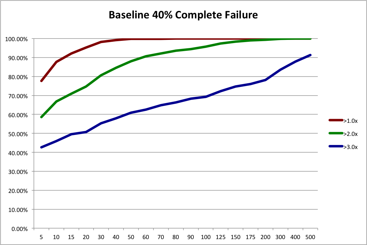
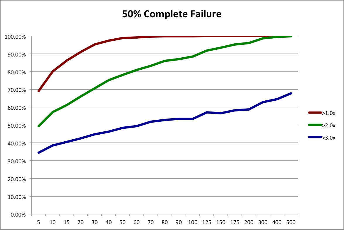
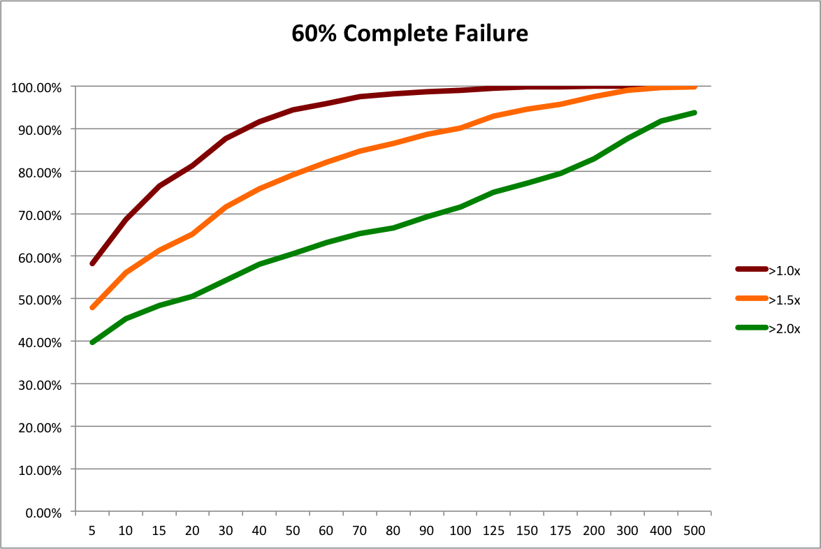
First, let’s reinterpret the “50% Complete Failure” scenario from the last post. Instead of looking at it as a possible future scenario for the angel market as a whole, let’s look at it as the possible future outcome distribution for a slightly different investing strategy, “Scalable Angel”.

This hypothetical strategy contrasts with the traditional investment strategy, “Custom Angel”. Using the Custom Angel strategy, individual angels and angel groups apply their substantial experience to perform a lengthy personalized screening and evaluation of each startup investment opportunity.  While very thorough, this strategy is not very scalable. It requires years to develop the necessary skill and a considerable amount of time to apply.

The Scalable Angel strategy is based on the Custom Angel strategy. However, it eliminates many screening and evaluation tasks that can’t be boiled down to policies, templates, and heuristics.  It still applies a lot of screening and evaluation. It even applies a fair amount of personalized attention. It just avoids the lowest-value and most time-consuming steps. While definitely more scalable, a lot of people may find it hard to believe that it could be as effective.

So for the sake of argument, let’s assume that it’s not nearly as good as the Custom Angel strategy and results in 50% more failed investments. The “Baseline 40% Complete Failure” scenario from the last post had 111 failures, while the “50% Complete Failure” scenario had 166, which is 49.5% more. So, conveniently, we can use the resampling of 50% Complete Failure to represent the outcome distribution for the Scalable Angel strategy.

Now, all we have to do is decide on reasonable portfolio sizes to compare.  In the original Rob Wiltbank Tech Crunch article that kicked off this series of posts, he recommended “…at least a dozen investments…”. To give Custom Angel the benefit of the doubt, let’s use 15.  My anecdotal experience is that a 15-investment portfolio would put an angel in the “very active” category.  On the other end of the spectrum, RSCM (my firm) is aiming for 250 investments in its fund and, as Dave McClure so kindly contributed in the comments of the last post, 500 Startups will have about 250 investments per fund.  But let’s again be conservative, so we’ll use 200 investments for our hypothetical Scalable Angel strategy.

It’s a simple mater to look at the last post’s spreadsheet and plot the probabilities of achieving different return multiples using the two strategies:

rscmstratecustomvsscalableangel

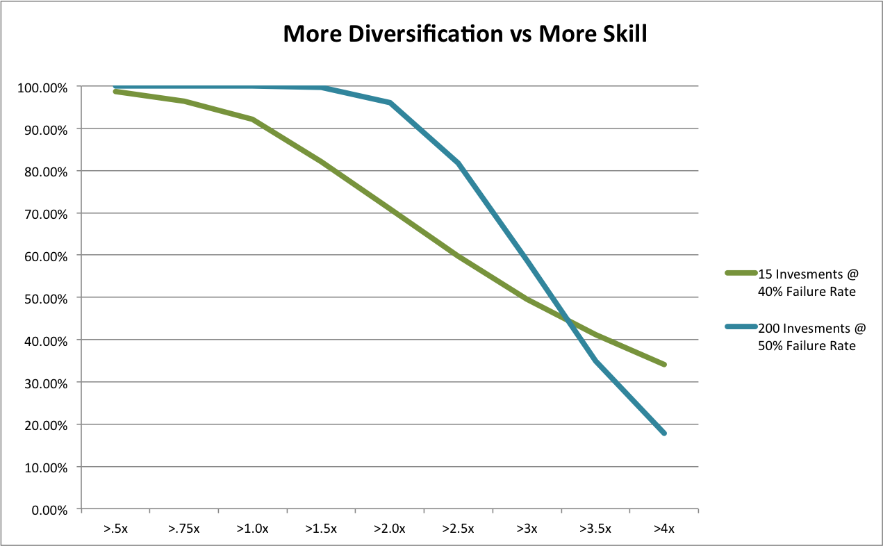
Due to our assumption of a much higher number of failures, Scalable Angel has a lower expected value, 3.66x vs 3.24x.  But is sure looks a lot safer overall! Scalable Angel did not have a single losing portfolio out of 10,000 simulations while almost 8% of Custom Angel portfolios lost money.  Scalable Angel has a whopping 24 percentage point advantage in doubling your money (95.17% vs 70.98%).  Even at tripling your money, where its lower expected value starts becoming apparent, it has a 9 percentage point advantage (49.61% vs 58.32%).

What about those nuances and disclaimers? Well, Scalable Angel certainly does not assume we can costlessly eliminate screening and due diligence. It assumes we can either streamline or find streamlined substitutes for many, but not all, aspects of screening and due diligence.  For those we can’t, it assumes we pay a pretty hefty penalty of 50% more complete failures.

Also, it assumes that angels are interested only in overall returns. Individual angels and angel groups may be legitimately concerned with the failure rate.  If part of why you like being an angel is the feeling you get from helping a company succeed, I would certainly understand wanting to maximize the number of successes even if that resulted in greater financial risk (especially if you were risking a very small fraction of your overall wealth). On the topic of risk, our conclusion further assumes angels are willing to sacrifice a bit of return on the high end for a much lower chance of  suffering outright losses or even under-performing the public equity market.  While individuals certainly differ, the empirical literature on risk preferences (nicely summarized here) supports this assumption for typical investors.

On the other hand, our current analysis also ignores some likely additional advantages of the Scalable Angel strategy. First, when you make a process more systematic, you usually reduce per unit costs. The AIPP data, indeed angels in general, do not track investment costs very precisely. My anecdotal experience is that a fair accounting of angel out-of-pocket and labor expenses would put them at a noticeable fraction of the dollars they invest. By ignoring these expenses, the AIPP data overstate the return of the Custom Angel strategy. Like any high-efficiency process, the Scalable Angel process would probably cut these costs dramatically, increasing its true relative return.

Moreover, high-volume processes tend to be more measurable than custom ones. Greater measurement leads to greater optimization. That’s the point of the whole “Big Data” trend! So even if the Scalable Angel strategy were initially less effective, over time, I bet it would close the gap in the expected failure rate, probably eventually surpassing Custom Angel.

Finally, I don’t think Scalable Angel would actually have a substantially worse outcome distribution. If you saw Moneyball, you know that some relatively simple metrics outperformed all those experienced baseball scouts performing their individual player evaluations.  In this old post, I present the strong empirical evidence against individual’s ability to predict success when a startup launches.  Now, ongoing individual attention probably provides some  benefit to a startup’s development.  But in practice, RSCM and 500 Startups provide quite a bit of this type of guidance.  If you performed a detailed comparison of this assistance vs the typical active angel’s assistance, I think it would be hard to argue that the difference would lead to 50% more failures.

So I think it’s pretty safe to say that our hypothetical Scalable Angel outcome distribution is an extremely conservative comparison to past practice.  And it still clearly outperforms in terms of risk-reward. From the perspective of angel investments as investments, the evidence strongly supports scalable approaches as a competitive option.

[Updated 4/25/2013: corrected minor error in spreadsheet and graph.]

What If the Angel Market Tanks?

In my last post, I showed how diversification helps an angel portfolio get closer to the true underlying return of the market.  Based on the AIPP’s historical sample of angel-backed startups that meet RSCM‘s investment criteria, we saw that 70 investments would have given you a ~90% chance of doubling your money and 200 would have given you an ~80% chance of tripling your money.

Of course, almost everyone has heard the disclaimer, “Past performance is no guarantee of future results.”  We don’t really know that angel investments made today will have the same outcome distribution as those made in the past.  No amount of statistical wizardy can change that.  However, the resampling technique I used in the last post does reveal how a diversified portfolio can provide some protection against losses if the angel market tanks.

Let’s call a “complete failure” an investment that loses more than 50% of the original capital.  Under that definition, the original sample has almost exactly a 40% failure rate: 111 out 277 investments.

So let’s adjust our resampling procedure to simulate different rates of failure in the future.  By simply adding in extra copies of the 111 “completely failed” investments, we can see what happens with 50%, 60%, and 70% failure probabilities. Obviously, expected returns decrease as failures increase.  But what about the chance of overall loss?  Does diversification protect us?

First, let’s refresh our memories with a graph of how different portfolio sizes fare under our baseline scenario of 40% complete failures.  Note, that I’ve extended the maximum portfolio size analyzed to 500.

aipprscmstrat40pctfailure

To simulate a 50% failure rate in the future, we start with our baseline sample and add 55 duplicate records of complete failures to create a new sample with a somewhat worse outcome distribution.  That makes the failure rate (111+55) / (277+55) = .50. The expected payout is now 3.24x instead of 3.66x. Then we run the resampling procedure on the new sample.  The next graph shows the resulting probabilities of achieving 1x, 2x, and 3x the original investment.

aipprscmstrat50pctfailure

Still not too bad.  We’d almost certainly double our money and have a decent chance of tripling.  What happens if the angel market really tanks?  By adding in more copies of complete failures, we can simulate 60% and 70% failure rates.  Expected payouts drop to 2.68x and1.97x, respectively.  The next graphs present the probabilities of 1x, 1.5X, and 2x outcomes for these scenarios.  3x is such a remote possibility, I’ve left it out and put in a 1.5X line to give us better resolution.

aipprscmstrat60pctfailure

aipprscmstrat70pctfailure

60% failures isn’t too bad.  We can still drive the chance of doubling our money above 90% with 500 investments.  70% complete failures sucks.  Especially when you look at it from the perspective of homeruns. Remember that big winners drive returns.  If a “homerun” is any investment with at least a 10x return, adding in all the complete failures drops the percentage of homeruns from from 7.6% in the baseline to 3.8% in the worst case. So in some sense, the market is only half as good.  Even then, a portfolio of 200 investments has less than a 5% chance of losing money and a portfolio of 500 investments has less than 1% chance. Diversification still provides decent protection.

Also consider that the most likely cause of such an awful angel market would be macro events that affect the entire economy.  The NASDAQ and S&P 500 would probably not be doing well either.

I think this analysis shows that diversification is a good idea even if you think the future angel market may fluctuate. This conclusion isn’t at all surprising.  Fundamentally, diversification reduces volatility.  If you think the future market might differ from the past market, that means you believe the market is more volatile.  Therefore, diversification is actually more important.

[Note added 4/3/2013: here is the Excel file I used for these simulations.]

[Updated 4/25/2013: corrected minor error in spreadsheet and graphs.]

How Many Angel Investments?

As regular readers know, I’m a huge fan of the AIPP data set collected by Rob Wiltbank.  In this TechCrunch article from a while back, Rob corrected the mistaken assertion that angels don’t make money.  He also said that, “Angel investors probably should look to make at least a dozen investments…” While this statement isn’t wrong, neither is it as nuanced as I would like.

In this previous post, I used simulated data to examine the issue of adequate diversification. As it happens, I’ve also privately analyzed this issue using Rob’s AIPP data, an analysis I will now make public. [Hat tip to Paul P, a colleague with a professional financial statistics background who inspired and reviewed the original analysis, though any mistakes remain mine.]

To achieve my fully nuanced answer, I need to address two issues. But I’ll devote separate posts to each issue.  This post addresses the issue that diversification is a tradeoff.  More diversification will always protect you slightly more from idiosyncratic risk, all other things being equal (see my diversification posts one and two). But diversification isn’t free. It’s harder to make 10 investments than 1, and harder still to make 100. As an investor, you want to know how much each additional investment reduces idiosyncratic risk so you can make the right tradeoff for you.

To demonstrate this tradeoff, I’ll focus on RSCM‘s particular investing strategy: seed stage, no follow on, technology sector.  I documented how I applied this strategy to the AIPP data set, complete with filtered data file, in this post. In principle, you could create a filtered data file for your own strategy as described in this other post and then apply the procedure below to calculate the precise diversification tradeoff for your strategy.

The key to the whole problem is a statistical technique called resampling; I’ll take the records from my filtered data file and create 10K portfolios for a variety of portfolio sizes, using random sampling with replacement. Then it’s straightforward to determine how much the historical returns at each portfolio size could vary. Essentially, we’re performing the following thought experiment: what if 10K angels randomly invested in the startups that Rob studied?  What if they each invested in 10, 20, 30,… companies?  How likely would a given angel have been to achieve a given return?

The return for the entire sample is a 42% IRR and a 3.7x payout multiple.  The graph below shows the probability of achieving at least 1x, 2x, and 3x the original investment for a range of portfolio sizes. [Excel file with data, sampling macro, and probability macro is here.]

aippstrateresampling2

Now you can see the diversification tradeoff.  Personally, I think a bare minimum is a 90% chance of getting at least your money back. That’s 15 investments based on the historical data. Roughly the same as Rob’s answer of a “dozen”. But I’d really prefer a 90% chance of doubling my money. That’s 70 investments. Now, if I’m managing other people’s money, I’d really like to push to an 80% chance of tripling their money, which is over 200 investments. I didn’t run 400 investments, but I’m guessing that is roughly the point at which you would have had a 90% chance of tripling other people’s money. [Update 4/2/2013: after doing a bunch or runs, it looks like it takes over 500 investments to achieve a 90% chance of tripling.] As far as I know, 500 Startups is the only firm other than RSCM that is even shooting for that level of diversification in a single portfolio.

So there’s my take on the first issue, diversification as a tradeoff. The second issue is essentially the old problem of, “Past performance is no guarantee of future results.” What if the return distribution of seed stage technology startups is different going forward than during the period Rob collected data? It turns out there’s a nifty way to use resampling to test the sensitivity of different levels of diversification to shifts in the return curve. That’s the topic of the next post.

[Updated 4/25/2013: corrected minor error in spreadsheet and graph]

Seed Bubble Watch 1st Half 2012

Yes, it’s time for another edition of “Seed Bubble Watch”.  The subtitle for this round is, “Still Waiting to Inflate.”

For notes on sources and methods, see my previous posts in the series here, here, and here.  Current spreadsheet is here. Now to the money charts:

The first chart shows a slight dip back towards 2009 and 2010 levels.  However, I think this is an artifact of seasonality in angel investing.  Comparing 1H2012 to 1H2011 for the angel data, there’s actually an increase of 7% from a $6.9B annual rate to a $7.4B annual rate.  It’s just that 2H2011 had a $12.1B annual rate.  I know of nothing specific that happened in the second half of last year to account for a spike, so my guess is that angel activity is just generally higher July through December.  My prediction is that when the full year 2012 numbers come out in April 2013, we’ll see 2012 angel investing at slightly over $10B.

Reported VC seed stage investing continues to drop (with my standard caveat that what VC’s call “seed” is probably different from angels).  But it was made up for by increases in the size of super angel funds. The obvious explanation is that super angels are taking over part of the VC seed function. I think there’s more to it than that, but substitution and specialization are certainly part of the story.

Recall that I aggressively assume super angels deploy all their dollars in one year, to make my synthesized investment metric maximally sensitive to detecting bubbles.  It looks like this assumption may not be too far out of line with reality.  Aydin Senkut’s Felicis Ventures is raising a $71M fund after a $40M fund in 2010.  Mike Maples’ Floodgate is raising $75M after $70M in 2010.   Lerer Ventures is raising $30M after $25M in 2011. Ron Conway’s SV Angel is raising $40M after $28M in 2011.  Chris Sacca’s Lowercase Capital is raising $65M after $28M in 2010. And finally, our big winner is Thrive Capital, raising $150M ($147M of which was already in the door as of 9/6/2012) after $40M in 2011. Given IA Ventures‘ big raise noted in our last installment, we’ve got two NYC new media funds blowing up. And it seems like a lot of the leading funds are on a 1-2 year cycle.

I think this data supports my previous assertions that there is no general seed bubble in the US.  However, it certainly seems plausible that Silicon Valley and NYC could have local bubbles given the increasing dollars going into super angel funds in those areas and anecdotal reports of high valuations.  But my ad hoc conversations with people at the super angels indicate they are investing in a wide variety of locations. It’s possible that, at the margin, angels and super angels are choosing to invest outside of Silicon Valley and NYC often enough that we’ve reached an equilibrium.

For the rest of 2012 and all of 2013, I think the big driver will be the overall economy. GDP growth was only 1.3% in the 2nd quarter and 2.0% in the 1st quarter. The 20-year average is 2.5%.  So I don’t expect a big increase in seed funding until we at least get above that rate.